
4 Advanced Sales Pipeline Dashboards Every Sales Leader Should Use

Alex Zlotko
CEO at Forecastio

Summary
A sales pipeline dashboard gives sales teams a clear view of pipeline health, risks, and expected revenue. When built correctly, it improves forecasting accuracy, highlights early warning signs, and aligns sales teams around real data.
The most effective dashboards focus on a small set of key sales metrics. Pipeline coverage, conversion rates, sales cycle length, and deal velocity define whether the pipeline is strong enough to hit targets. Metrics like slippage rate and stalled deals reveal hidden risks that often go unnoticed.
Static pipeline snapshots are not enough. Teams need to track pipeline dynamics to understand what is changing over time. New deals, slipped deals, and lost deals explain performance better than any single snapshot.
A strong pipeline dashboard should answer critical questions. Do we have enough pipeline? Where are deals getting stuck? Which deals are at risk? Are close dates realistic? These answers drive faster and more informed decisions.
Advanced dashboards, such as pipeline overview, waterfall analysis, stage analysis, and deal velocity, provide deeper insights into performance and bottlenecks. Platforms like Forecastio help teams go beyond basic reporting and understand what is really happening in the pipeline.
Teams that use these insights effectively can remove bottlenecks, improve conversion rates, reduce slippage, and close more deals. The result is more predictable growth.
What is a sales pipeline dashboard?
A sales pipeline dashboard is a visual tool that helps sales leaders, sales managers, and sales teams track, analyze, and manage their sales pipeline in one place. It brings together key sales data, showing how deals move through each pipeline stage, where risks exist, and whether the team is on track to hit sales goals. Instead of relying on scattered reports or spreadsheets, a pipeline dashboard provides a clear, real-time view of sales performance.
At its core, a sales pipeline dashboard organizes complex sales data into simple visuals like charts, tables, and bar chart reports. It connects multiple data sources, often from a CRM, and turns raw data into actionable insights. This allows sales teams to focus on what matters most. Closing more deals and improving efficiency.
A well-designed dashboard helps you:
Track the total number and value of deals in the pipeline
Understand conversion rates between stages
Monitor sales cycle length and deal progress
Identify risks in real time
Why sales pipeline dashboards matter
A sales pipeline dashboard matters because it turns scattered sales data into clear, actionable insights. It helps sales leaders, sales managers, and sales teams understand pipeline health, spot risks early, and stay aligned around real numbers. Instead of reacting too late, teams can make faster, more data driven decisions and improve overall sales performance.
It improves forecasting accuracy
A sales pipeline dashboard makes forecasts more accurate by using real sales data instead of assumptions.
It helps teams:
Understand pipeline coverage vs sales goals
Analyze historical conversion rates and closed deals
Reduce reliance on subjective input from each sales representative
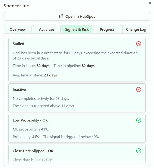
It helps detect risks early in the pipeline
A strong sales dashboard highlights risks before they become problems.
It surfaces:
Stalled deals with no recent sales activity
Deals stuck in the same stage for too long
Frequent close date changes
This allows sales managers to take action early and protect pipeline value.
It aligns sales teams around real data
A shared sales pipeline dashboard keeps the entire team aligned.
Everyone works with the same data, which:
Reduces confusion
Creates healthy competition
Improves accountability and individual performance
This ensures that decisions are based on facts, not opinions, leading to stronger and more consistent sales performance.
What key sales pipeline metrics to track?
A strong sales pipeline dashboard focuses on a set of core sales metrics that directly impact revenue. These metrics help sales teams understand pipeline health, performance, and future outcomes. Without them, it is difficult to make informed decisions or optimize the sales process.
Here are the key metrics every dashboard should include:
Pipeline size and coverage
Pipeline size shows the total value of all open deals. Coverage compares this value to your sales goals.
For example:
Target: $1M
Pipeline: $3M
Coverage: 3x
This helps determine if you have enough pipeline to hit targets.
Conversion rates by stage
Conversion rates measure how deals move from one pipeline stage to another.
They help:
Identify weak stages
Improve win rate
Optimize the sales process
Average deal size
The average deal or deal size shows the typical revenue per deal.
This metric helps:
Plan pipeline requirements
Forecast revenue more accurately
Sales cycle length
Sales cycle length measures the time from start date to closing.
Shorter cycles often mean:
Faster revenue generation
Higher efficiency
Deal velocity
A deal velocity metric shows how quickly deals move through the pipeline.
It highlights:
Outliers (too slow or too fast deals)
Pipeline stages where deals slow down
Deal cycle
Pipeline growth and shrinkage
This tracks how the pipeline changes over time.
It includes:
New deals added
Deals lost
Deals expanded or reduced
Slippage rate and close date accuracy
Slippage measures how often deals move to a later period.
High slippage indicates:
Poor forecasting
Weak pipeline control
Stalled deals and inactivity metrics
These metrics track deals with no recent sales activity.
They help identify:
At-risk deals
Missed follow-ups
Coaching opportunities
Together, these metrics provide a complete picture of pipeline health.
4 examples of advanced sales pipeline dashboards
Advanced sales pipeline dashboards go beyond basic reporting. They do not just show what is in your pipeline. They explain how it performs, how it changes, and where problems appear. This is critical for revenue leaders who want to make data driven decisions.
Below are four key dashboards used in platforms like Forecastio.
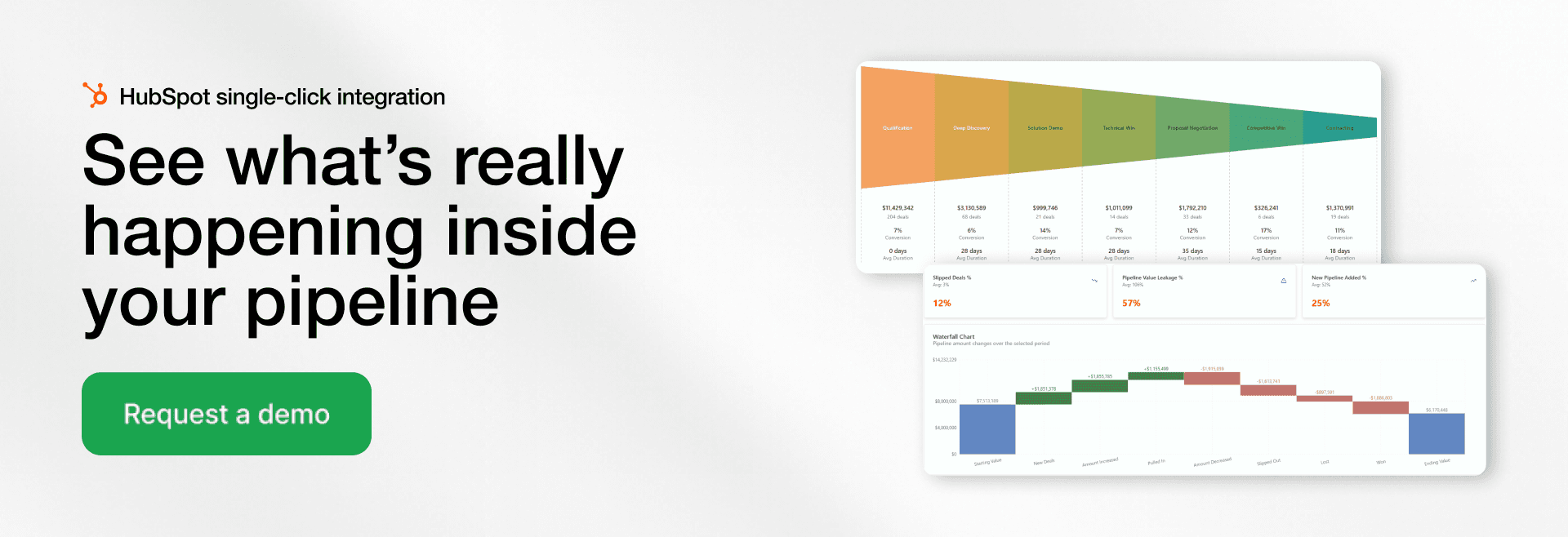
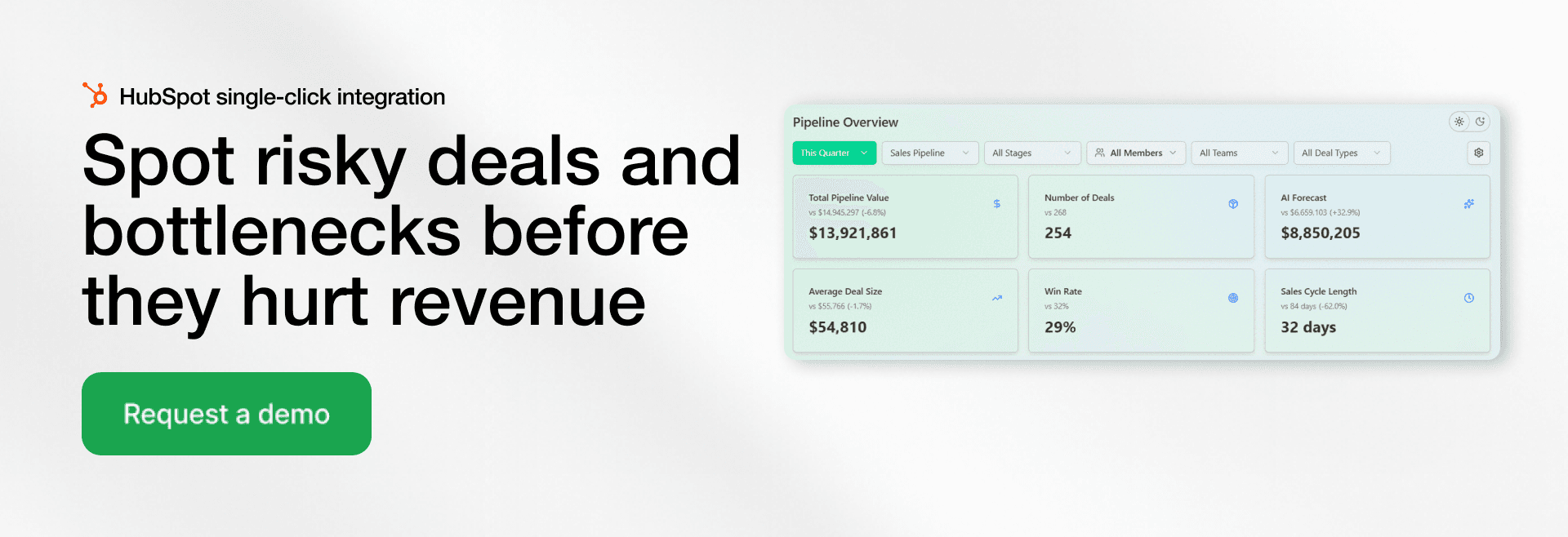
Pipeline Overview
The Pipeline Overview gives a high-level view of your entire sales pipeline for a selected period. But a strong sales pipeline dashboard does more than that. It compares current performance with a similar period in the past.
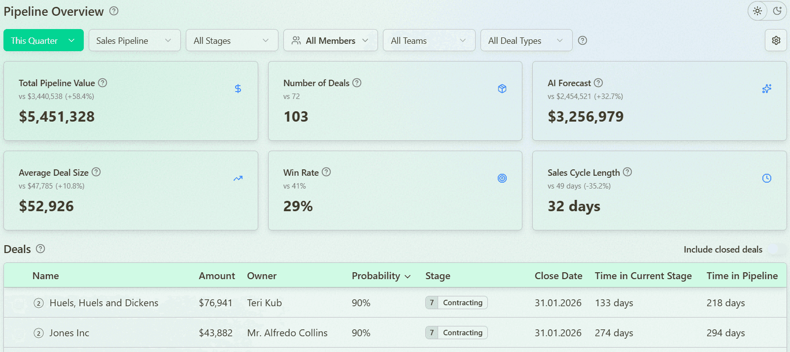
This allows you to instantly understand trends and answer a key question. Is your pipeline improving or underperforming?
It typically includes:
Total pipeline value
Win rate
Sales cycle length
Average deal size
By comparing current vs past metrics, sales managers can quickly identify gaps and adjust strategy.
Pipeline Waterfall Analysis
Pipeline Waterfall Analysis shows how your pipeline changes over time. It explains where your revenue comes from and where it is lost.
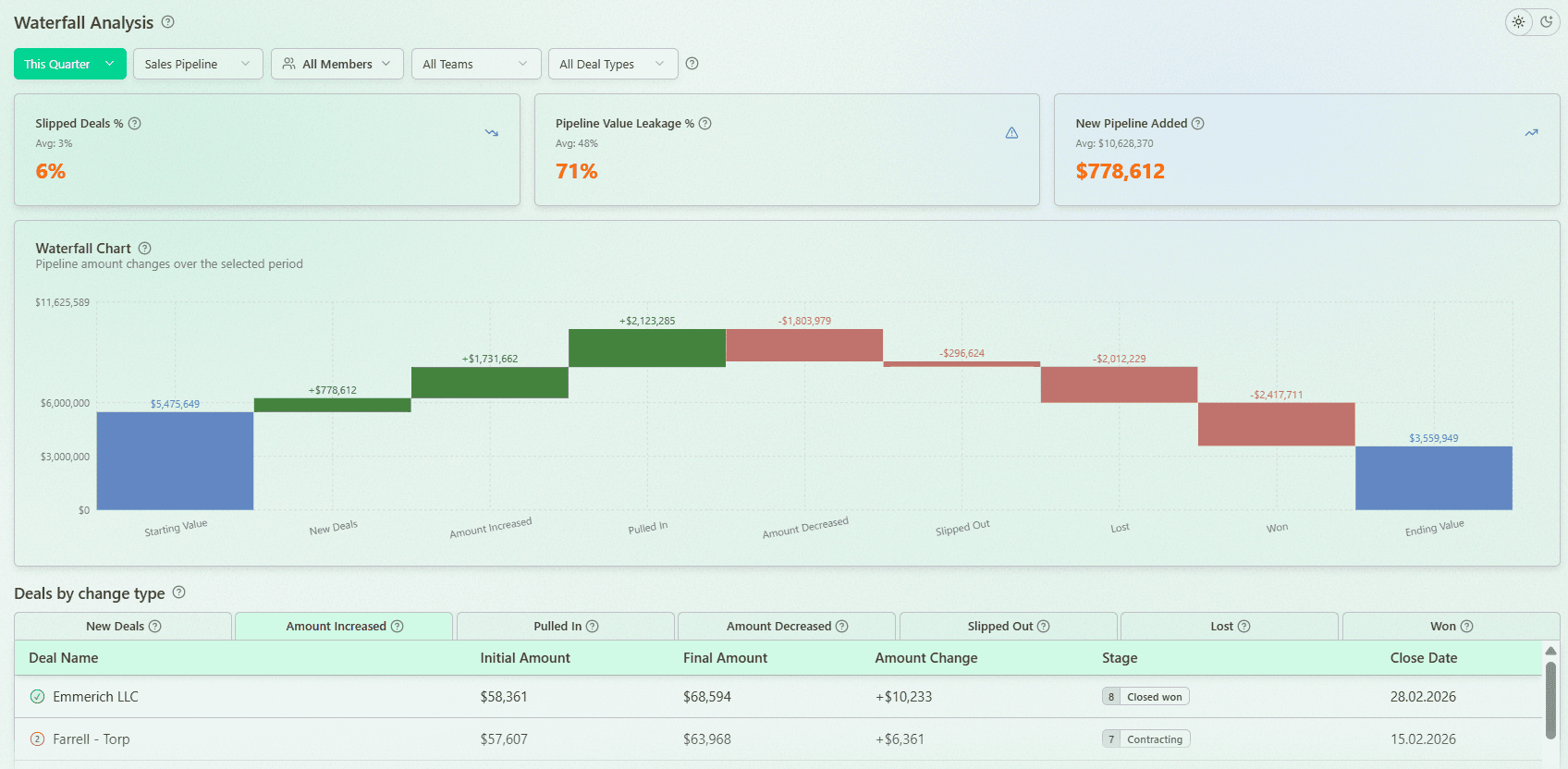
It tracks:
New deals added
Pulled-in deals (moved to earlier close dates)
Slipped deals (moved to later periods)
Lost deals
Expansion and contraction of deal size
A strong dashboard also highlights critical metrics like:
Slippage rate
Revenue Leakage Rate
These are compared against your historical averages. This helps you understand if you are losing more revenue this quarter than usual and take action early.
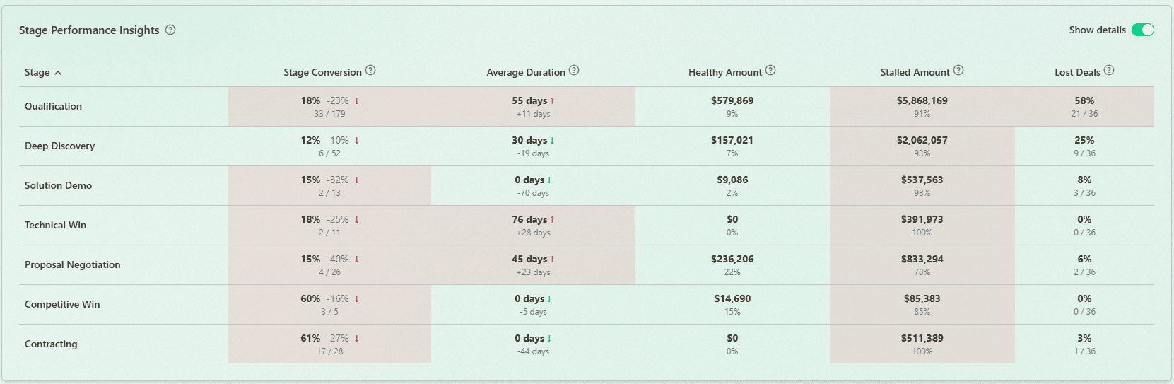
Pipeline Stage Analysis
This dashboard focuses on performance at each stage. It helps you understand how deals move through your sales process and where they slow down.
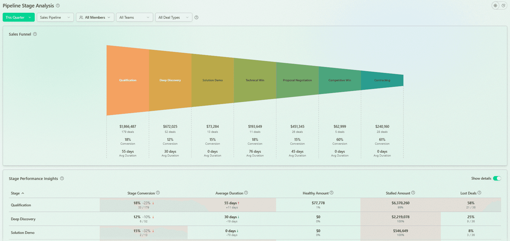
It includes:
Stage conversion rates
Time in each stage
Identification of bottlenecks
Stage accumulation (where deals pile up)
A key advantage is comparison with previous periods. This helps you detect new bottlenecks and understand whether performance is improving or declining.
It also highlights:
Where most deals are lost
Which stages contain stalled vs healthy pipeline
This gives clear actionable insights for improving conversion rates.
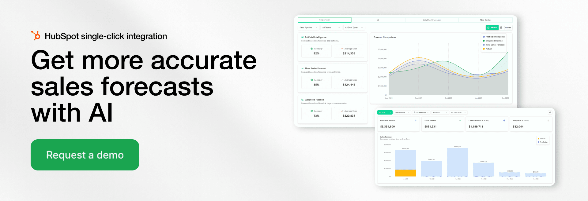
Deal Velocity Analysis
Deal Velocity Analysis shows how quickly deals move through the pipeline. It analyzes all deals, not just closed deals, which gives a more realistic view of your sales cycle.
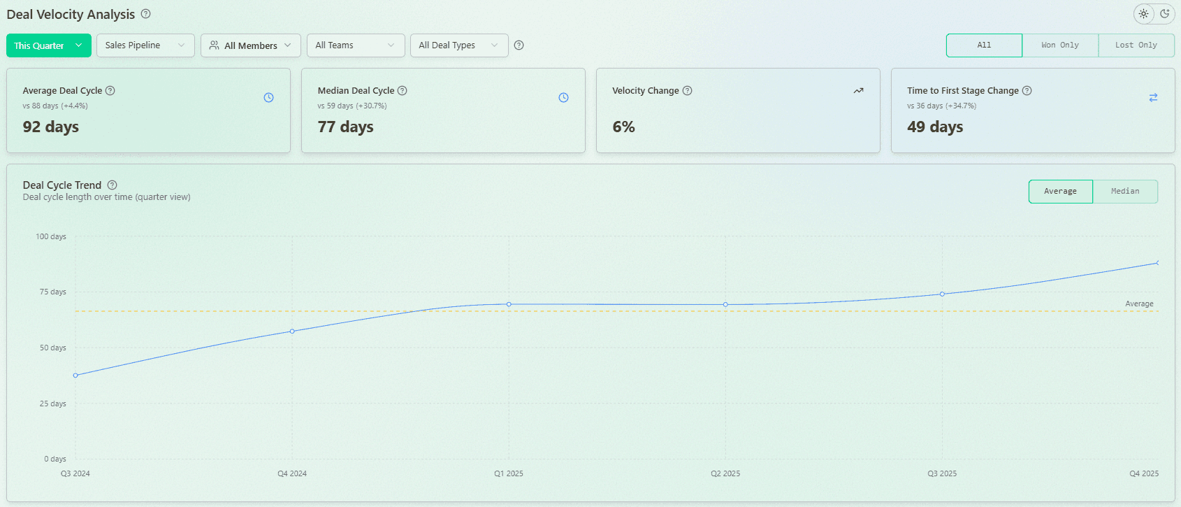
It typically includes:
Average vs median velocity
Velocity by sales representative, segment, or team
Time-to-close trends
Identification of outliers
Outliers are especially valuable. You can analyze the fastest and slowest deals to understand what drives performance.
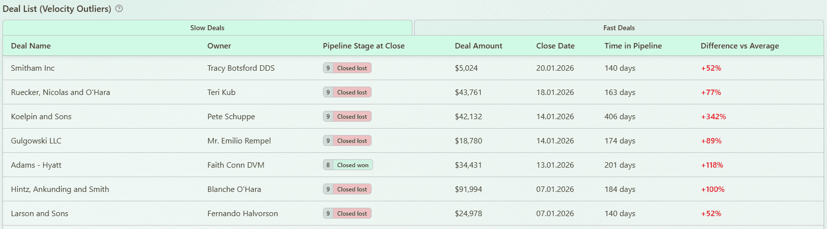
This helps sales teams:
Identify where deals slow down
Replicate successful patterns
As a result, teams can close more deals and improve overall efficiency.
Sales pipeline snapshots vs dynamics
A sales dashboard should not only show the current state of the pipeline. It should also track how the pipeline changes over time. This is the difference between snapshots and dynamics. Understanding both is critical for making decisions.
What is a pipeline snapshot?
A snapshot shows the pipeline at a specific moment.
It includes:
Total pipeline value
Number of deals
Distribution by stage
Snapshots are useful for quick reporting. For example, a weekly report or quarter review.
Why static views are not enough
Static views do not explain what changed.
You cannot see:
Which deals were added
Which deals were lost
How progress evolved
This limits your ability to understand performance.
Tracking changes over time (real pipeline movement)
Dynamic tracking shows how the pipeline evolves.
It captures:
New deals entering the pipeline
Deals moving between stages
Changes in deal size or close dates
This provides deeper analytics and visibility into the sales process.
How dynamics improve decision-making
With dynamic insights, teams can:
Identify trends early
Detect risks faster
Adjust strategy based on real data
Platforms like Forecastio focus heavily on pipeline dynamics. They show what changed and why. This is essential for improving forecasting and performance.
What questions should a sales dashboard answer?
A good pipeline dashboard answers the most important questions about your pipeline and performance. It helps sales leaders and managers quickly understand what is happening and what actions to take.
Do we have enough pipeline to hit targets?
The dashboard should clearly show:
Pipeline coverage
Gap to target
Required pipeline value
This helps teams stay focused on hitting sales goals.
Where are deals getting stuck?
By analyzing stage data, you can identify bottlenecks.
Look for:
High volume in one stage
Low conversion rates
Which deals are at risk and why?
Risk analysis should highlight:
Stalled deals
Deals with no recent activity
Deals with frequent close date changes
What changed in the pipeline this week?
A strong dashboard shows weekly changes.
This includes:
New deals
Lost deals
Slipped deals
This helps track real pipeline movement.
Are close dates realistic?
Many teams struggle with unrealistic close dates.
The dashboard should compare:
Expected vs actual close dates
Historical trends
Which reps or teams are underperforming?
Performance insights should break down:
Individual performance
Team results
Conversion and win rate
This enables better coaching opportunities and accountability.
Software for better sales pipeline reporting
Choosing the right tool is critical for building effective sales pipeline dashboards. Different types of tools offer different capabilities. The best choice depends on your business, team size, and data complexity.
CRM tools
CRM systems are the foundation of pipeline reporting.
They provide:
Basic pipeline tracking
Deal management
Contact and lead management
Examples include HubSpot and Salesforce.
BI tools
BI tools like power bi or Tableau allow advanced reporting.
They help:
Combine multiple data sources
Build custom dashboards
Analyze complex sales data
However, they often require manual setup.
Revenue intelligence platforms
Platforms like Forecastio or Clari provide deeper insights.
They offer:
Advanced pipeline analytics
Forecasting models
Risk detection
Audit trails
These and other tools are designed specifically for sales leaders.
What to look for in a pipeline dashboard tool
When selecting a tool, focus on:
Real-time data access
Easy-to-use dashboard interface
Ability to track pipeline dynamics
Strong analytics and sales forecasting
Quick Integration with your crm
The right tool helps teams move from reporting to action. It enables better decisions and forecasts.
FAQ
What is a pipeline dashboard?
A pipeline dashboard is a visual dashboard that shows all active deals across each pipeline stage. It helps sales teams and sales managers track sales data, monitor progress, and identify risks. By using clear metrics and charts, teams can make better decisions. It also helps improve forecasting.
What are the 5 stages of a sales pipeline?
The five common stages of a sales pipeline are lead generation, qualification, meeting or demo, proposal, and closing. Each stage represents a step in the sales process as a lead moves toward becoming a customer. Tracking movement between stages helps improve conversion rates and identify bottlenecks at a current stage. A pipeline dashboard makes it easier to track progress at each stage.
What is a sales dashboard?
A sales dashboard is a tool that displays key sales metrics and sales data in one place. It helps sales teams monitor sales performance, track revenue, and evaluate results. Most dashboards pull data from a CRM or other data sources. They provide quick insights to support better decisions.
What are the 4 types of dashboards?
The four main types of dashboards are operational, analytical, strategic, and tactical. Operational dashboards track daily sales activity and short-term performance. Analytical dashboards focus on deeper analytics and trends in data. Strategic dashboards show long-term business performance, while tactical dashboards help managers track team execution and goals.
What is a sales pipeline?
A sales pipeline is a structured view of all active deals in the sales process, organized by stage. It helps sales teams track progress from first contact to closed deals. A well-managed pipeline shows the total value, number of deals, and expected revenue.
Share:


